07/17/2023
uPDATED
portfolio
MZ
Platinum


MZ
Who we are
MZ Platinum is a dynamic social media and creative agency, founded by three brothers - an Engineer, an Architect, and a Stylist. We unite functionality, creativity, and art direction to turn social media expectations into extraordinary realities. With a passion for innovation and a relentless pursuit of excellence, we elevate brands to new heights of sophistication and success. Join us on our transformative journey and redefine possibilities together.

MZ
what we do
we curate captivating experiences for social media audiences through a comprehensive range of services. Our expertise includes crafting innovative social media strategies, creating engaging content, designing graphics, producing compelling reels and videos, photoshoots and video shoots, and ensuring seamless event management. Additionally, we excel in branding, theme page development, and all aspects related to social media and creative content. With our holistic approach, we bring your brand's story to life and captivate audiences across digital platforms.
CAT LEAPERS
BRANDING

PAGE 01
03
SLOGAN
04
LOGO
ELEMENTS
05
LOGO
10
TYPOGRAPHY
11
DIGITAL FORMATS
12
DIGITAL
FORMATS
13
DIGITAL
FORMATS
06
LOGO COLOR SCHEMES
CONTENTS
07
RATIONAL
DESIGN
08
COLOR
PALETTE
09
TEXTURE
PAGE 02

CAT LEAPERS
We teach you to overcome obstacles not only physically but
also mentally.
Leapers

quote by : Cat Leapers
PAGE 03
About
Cat Leapers
Cat Leapers is a parkour team that wants to inspire people with their skills and movements and they will start opening their training place with a neon light design.
CAT LEAPERS
PAGE 04

05
Logo Design
Team Logo
Energetic
The team wanted a logo that looks like football teams that have cat face on the logo also with some colors.
PAGE 05
CAT LEAPERS

Logo
Energetic & fearless like the parkour team with 2 main colors of the team with the name

CAT LEAPERS
PAGE 06

PAGE 06
Logo Color Schemes
Logo Only
Rational Design
Presentations are communication tools that can be used as demonstrations, lectures, speeches, reports, and more.

PRINTED MATERIAL


DIGITAL MATERIAL
PRODUCTS AND SIGNAGE
Color Palette
PAGE 08
CAT LEAPERS

HEX CODE #FFFFFF

HEX CODE #000000
CMYK 0, 0, 0, 0
RGB 255, 255, 255

HEX CODE ##001787

HEX CODE #FA0764
CMYK 100, 83, 0, 47
RGB 0, 23, 135
CMYK 0, 97, 60, 2
RGB 250, 7, 100
PAGE 09
Background Images
These are the backgrounds used for any background needed for any post on any social media platforms or any presentation.

Typography
FOR HEADINGS AND TITLES
& SUBTITLES AND PARAGRAPHS
Presentations are communication tools that can be used as demonstrations, lectures, speeches, reports, and
more. It is mostly presented before an audience.
Aa
OPEN SAUCE SEMIBOLD
Aa Gg Mm Ss Yy 04
Bb Hh Nn Tt Zz 05
Cc Ii Oo Uu 00 06
Dd Jj Pp Vv 01 07
Ee Kk Qq Ww 02 08
Ff Ll Rr Xx 03 09
PAGE 10

PAGE 11
MZ
Branding
05
CAT LEAPERS
Posters Designs
CAT LEAPERS

PAGE 12
Reflective of
brand DNA
Strong | Focused | Fun | For All
Image Library
Presentations are communication tools that can be used as demonstrations, lectures, speeches, reports, and more. It is mostly presented before an audience.

Cards
Reflective of brand DNA
PAGE 13
PAGE 13
CAT LEAPERS
Digital formats
Applications


Fly


Flip

PAGE 14
Website
Applications
PAGE 15
MOBILE APP BRANDING

03
SLOGAN
Branding 2020
04
ABOUT
05
LOGO
06
LOGO COLOR SCHEMES
07
RATIONAL
DESIGN
08
COLOR
PALETTE
09
TEXTURE
10
TYPOGRAPHY
11
DIGITAL FORMATS
12
DIGITAL
FORMATS
13
DIGITAL
FORMATS
Contents
//02
ADDEM APP
//03
Find your perfect university fit


Branding 2020
About Addem App
//04

Built by
Mohaned Zaki
Addem is a mobile app that helps in connecting students with universities and even helps in the education process
MADE FOR LEAERNERS

Branding 2020
//05
Logo Elements

Branding 2020

Logo Symbol
Education
Speed
AstraStrong
Ease - Simple
SUPPLEMENTARY ELEMENTS
Those where the key words for the logo making
Logo
//06
Icon Logo Normal Logo

Branding 2020

//07
Logo Color Schemes


Branding 2020
Rational Design
Presentations are communication tools that can be used as demonstrations, lectures, speeches, reports, and more.
Logo Placement

PRINTED MATERIAL


Color Palette
DIGITAL MATERIAL

HEX CODE #FFFFFF

HEX CODE #1A4899
PRODUCTS AND SIGNAGE

HEX CODE #000000
CMYK 0, 0, 0, 0
RGB 255, 255, 255
CMYK83, 53, 0, 40
RGB 26, 72, 153
CMYK 0, 0, 0, 100
RGB 0, 0, 0

HEX CODE #A9A3A3

HEX CODE #E3E2E0
CMYK 0, 4, 4, 44
RGB 169, 163, 163
CMYK 0, 0, 1, 11

RGB 227, 226, 224
//09
Texture


FOR USE IN BACKGROUNDS AND TEMPLATES

Library of Patterns
Presentations are communication tools that can be used as demonstrations, lectures, speeches, reports, and more.
//10

Branding 2020
Digital formats
Applications
Digital formats
Applications


APP AND WEBSITE
//11
APP AND WEBSITE
//12
4
Branding Design.
5
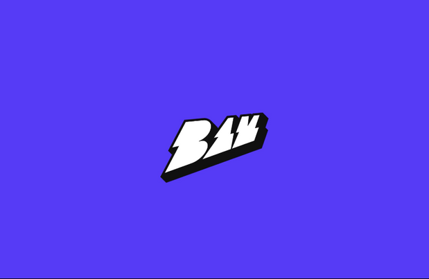
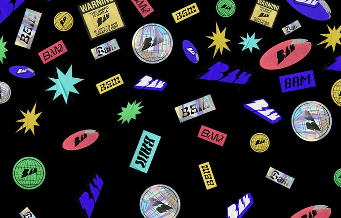
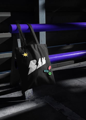
Client : BAM AGENCY. Date : 07 - 09 - 2022
RE-branding
BAM is a modern advertising agency founded in 2011 by Ahmed Mansour in Cairo, Egypt. The name was created to reflect the agency’s impact on its brands & people.
BAM’s Visual Identity was developed to display the dynamic essence of the brand & the logo literally verbalizes the brand name. The colors are dedicated to bursting the brand’s posi- tioning and reflect on its creativity, flexibility & youthfulness.
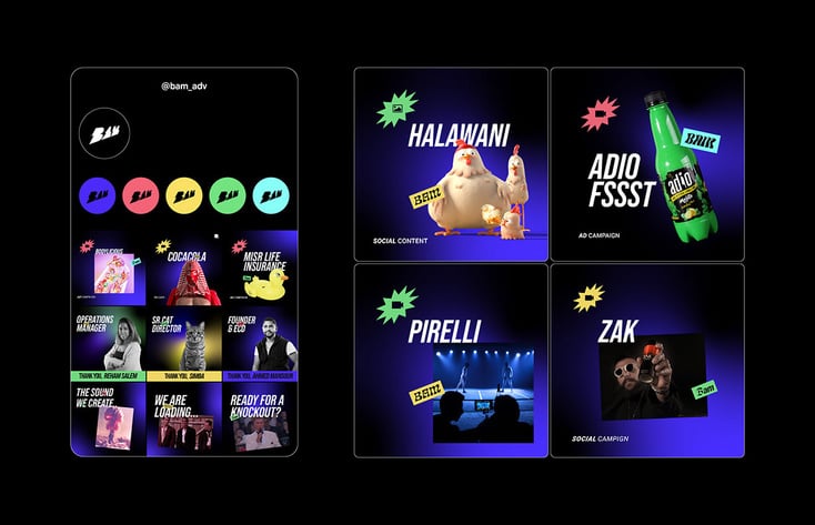
Image By
Stephany Anderson.


6
Branding
Design.
7
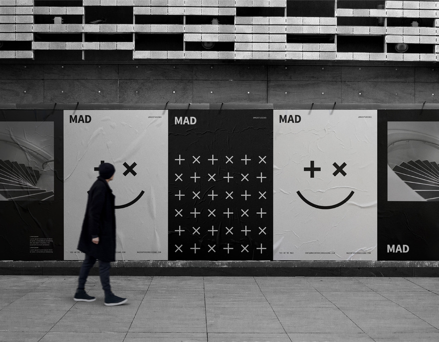
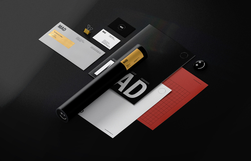
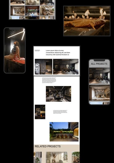
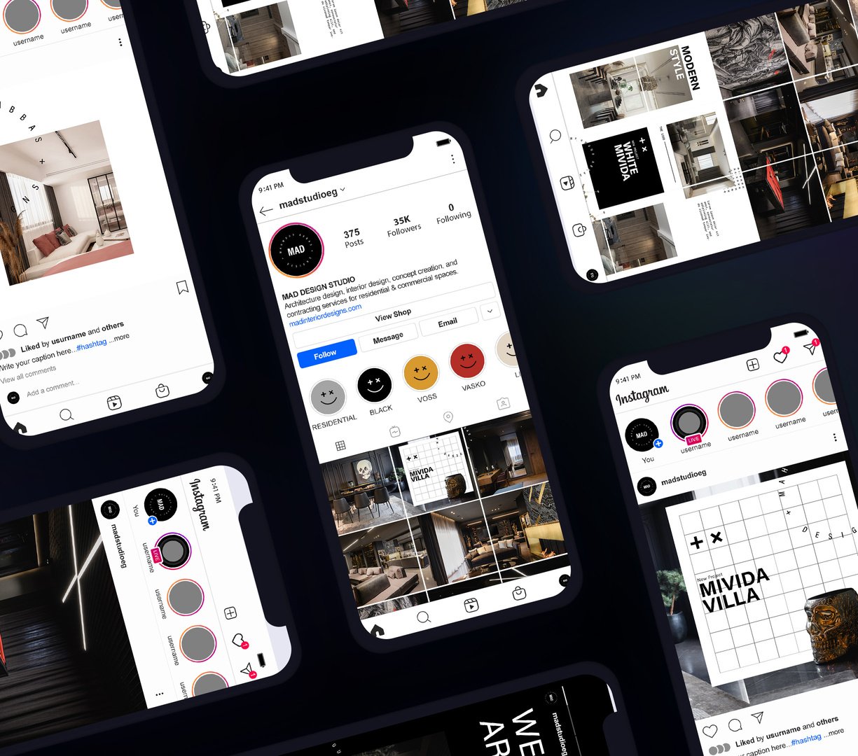
Client : MAD Studio Date : 28 - 02 - 2022
RE-branding
Bladesmith branded MAD’s identity from scratch, coming up with the name ‘MAD’, a sleek
name with several interpretations. MAD hits two stones by using the initials of the founder and the essence of the company, resulting in Mahmoud Abbas Designs – MAD. Another play on the name is to play on the literal meaning, where each design is unique, bold, and loud.
In addition to the naming, Bladesmith worked on developing a logo, website, applications, stationary, and a prominent brand identity. MAD’s logo places the name as a focal point to speak for the brands power. The color palette is dedicated to extravasating the brand’s positioning and reflecting on its elegance, sophistication, and capabilities.
We deliberately crafted a prominent brand element that takes the form of a smiley face
- gone mad. This simple approach clearly communicates the brand name, makes it more memorable and gives it a witty edge to serve a wider audience range. As for the brand identity, the Bladesmith Team was able to accurately deliver the brand’s vision through a simplistic,
yet modern, approach made to accentuate the brand’s suave approach in work and business across all platforms, elements, and applications.

8
Client : BTS Gold
Date : 23 - 04 - 2022
9
Branding Design.
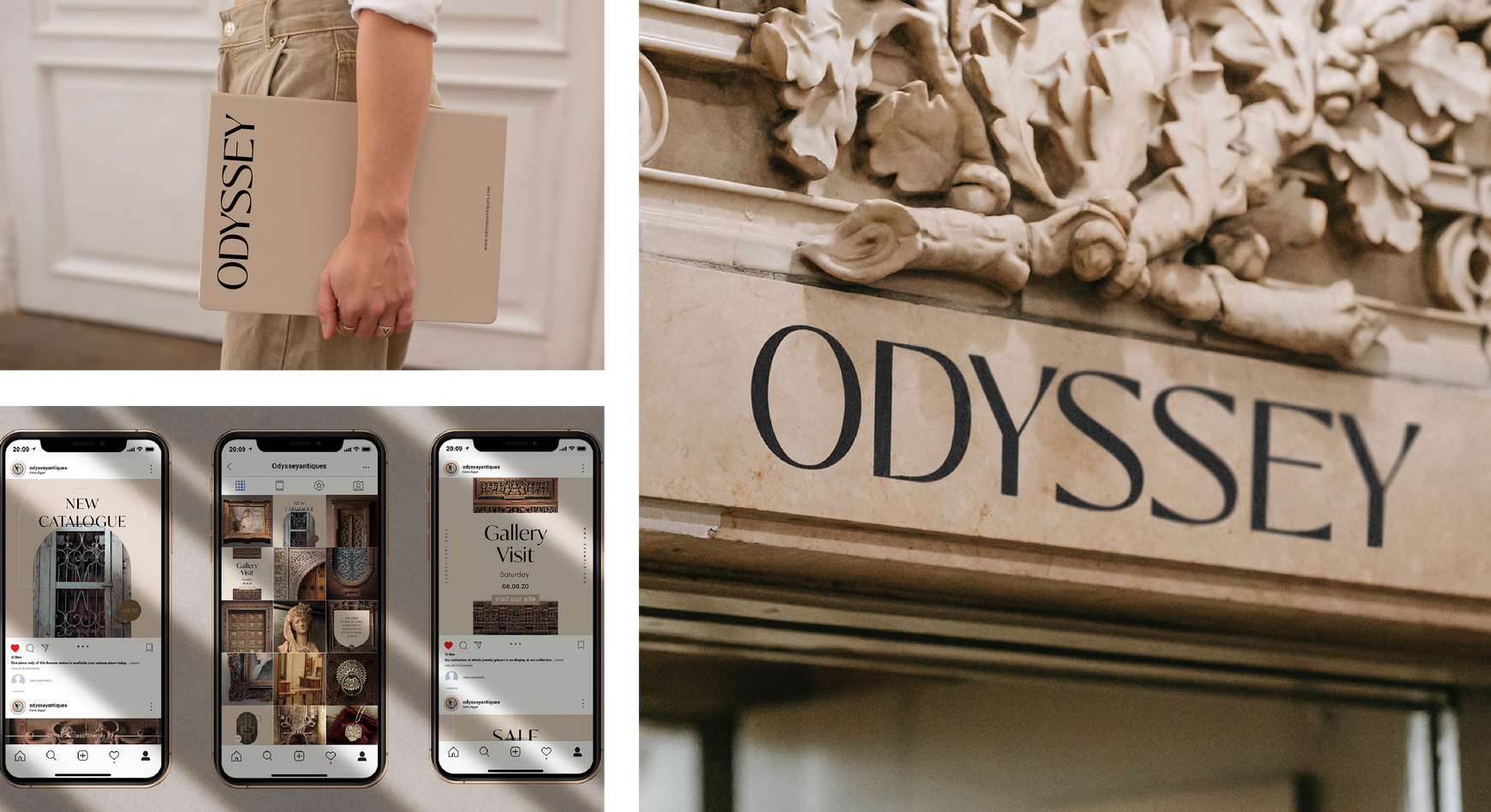
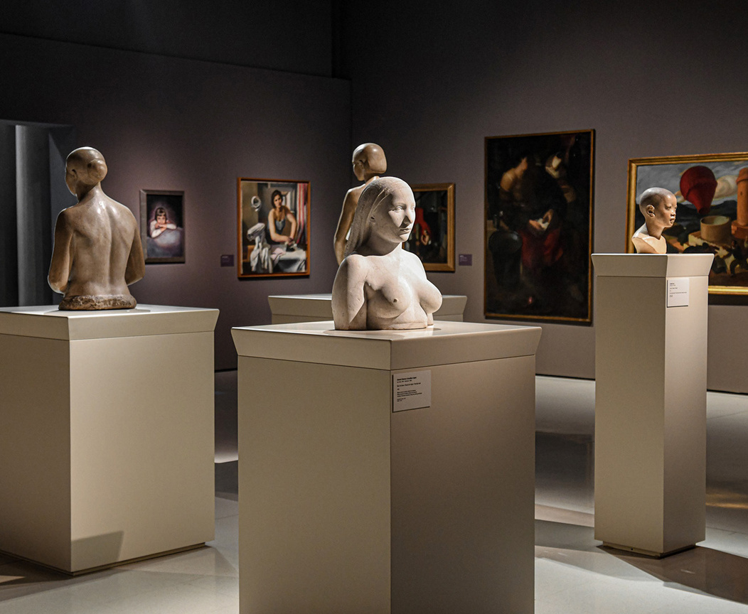
Odessey.
Odyssey is the latest addition to the EG Gold chain. They have been leading the gold, diamond and silver market in Egypt since 1935, aiming to penetrate and lead the antiques industry. The revolutionary experience they offer differentiates them amongst their competitors. Odyssey is not an average antiques showroom but rather a passage through time – a magical time travel experience.
Located in Egypt’s oldest and most beautiful area - Al Korba - Odyssey was established after the passing of Mostafa Nassar, father of the EG Gold chain. The journey started when his sons discovered his long-hidden treasures – an exquisite antique collection. They vowed then to keep his legacy alive allowing
others to embark on this treasurable journey that their father had been on for quite a long time, thus founding Odyssey.
Bladesmith’s design team created Odyssey’s identity by shedding light on their eloquent antiques, making Odyssey an experience rather than just an antique house. The logotype communicates Odyssey’s historical richness, elegance and sophistication while the use of nude colors speaks for the brand’s articulate antiquity.
A prime brand element used is the sundial, speaking loudly for
the unique historic time Odyssey lets you live in. A sundial is an ancient instrument that uses the sun’s movement across the sky and its shadow alignment with different hour-lines to tell time.
Being a sole part of the brand’s identity, the sundial poses as
a symbol of change, history and Nassar’s everlasting legacy. In
that sense, Odyssey is a wandering journey, but with the sundial, Odyssey is a wandering journey through time.


10
Branding Design.
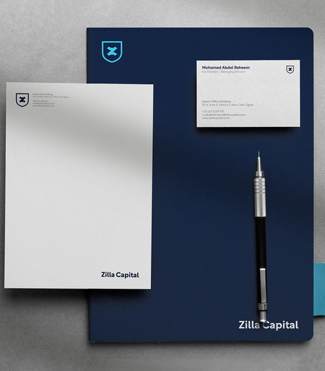
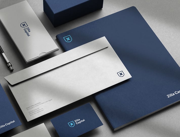
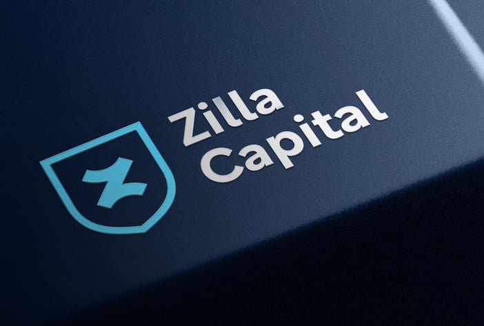
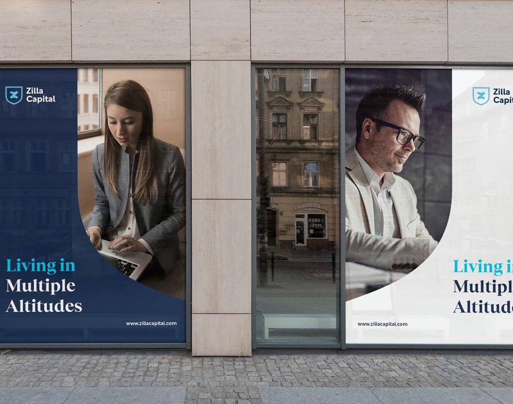
Client : Zilla Capital Date : 11 - 07 - 2021
RE-branding
Zilla Capital is a merge between two formerly individual entities serving different purposes in the financial and investment sector. Merged together, these two firms
have grown into one, making them the ultimate comprehensive firm for financial and investment needs. Their youthful edge is a catalyst instigator of their success today and the bright future that awaits them.
Inspired by the one of the world’s most unique flowers – the Zilla flower - the logo combines the letters ‘Z’ and ‘X’ to reflect on the two firms’ merge. This dynamic logo is optically illusive, where the eye translates the icon as an ‘Z’ up close, but when the logo is zoomed out it then looks like an ‘X’, mirroring the looks of a Zilla flower and signifying a promising merge.
The design team wanted to portray the firm’s strength and diverse range of services, while still highlighting a young and energetic attitude. The different shades of blue are purposefully incorporated – where the dark blue shade portrays trust and capabilities, and the lighter shade gives off a smart and youthful vibe.
11

12
Branding Design.
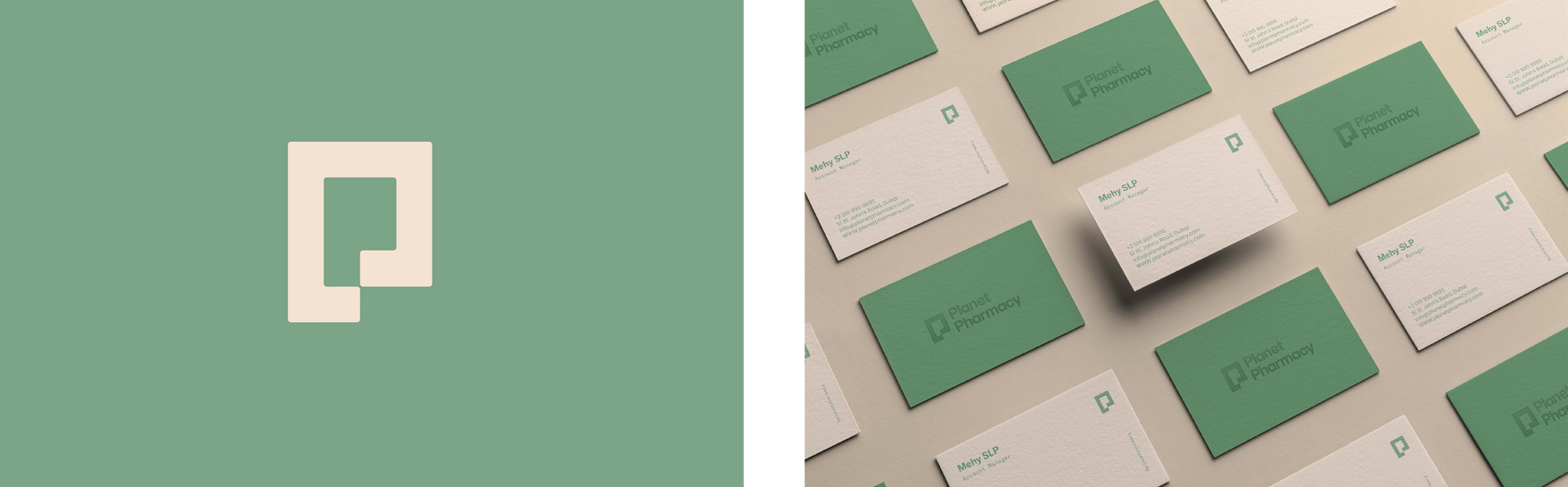
Client :Planet Pharmacy Date : 07 - 09 - 2022
13
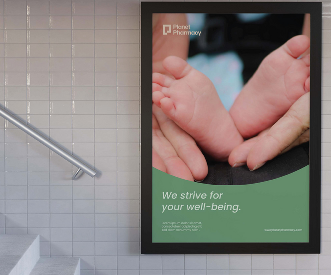
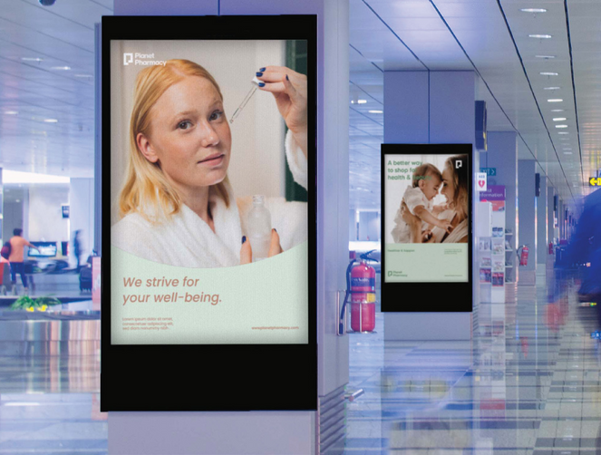
RE-branding
We made the Full branding based on this concept, the colors are nature / earth colors where we were inspired from the name of the pharmacy «Planet» also the graphical elements were taking from the logo itself. We just changed a little bit in the logo we made the icon more friendly and welcoming. We also changed the Wordmark to make it more readable and to make it fit with the icon. We made both the icon and the word mark more rounded insted of the sharp edges. This earthy color palette is a perfect fit for the brand to showcase Sustainable Clinic’s principles and pillars. All colors are a combination of colors we find around us and bring some sort of tranquility. Mint is used to speak
for ambition, power, and nature. Pumpkin represents purity, hope and honesty. The incorporation of maximum yellow red is to communicate happiness, while bone and green sheen are meant to signify dependability. Grouped together, the brand is now representable, powerful, and ready to make a change. We chose to play aound with this the leaves to show the two main keywords health and sustainability. Also the leaves are taken from the logo but with an abstract way.

20
Branding Design.

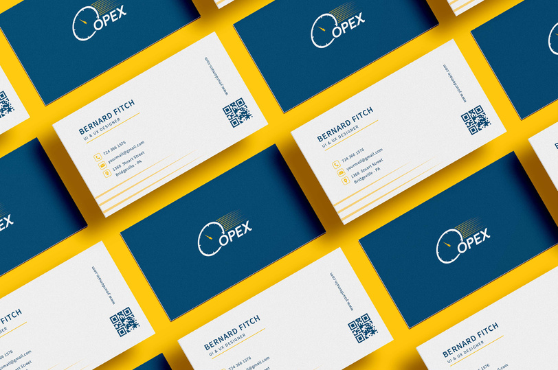
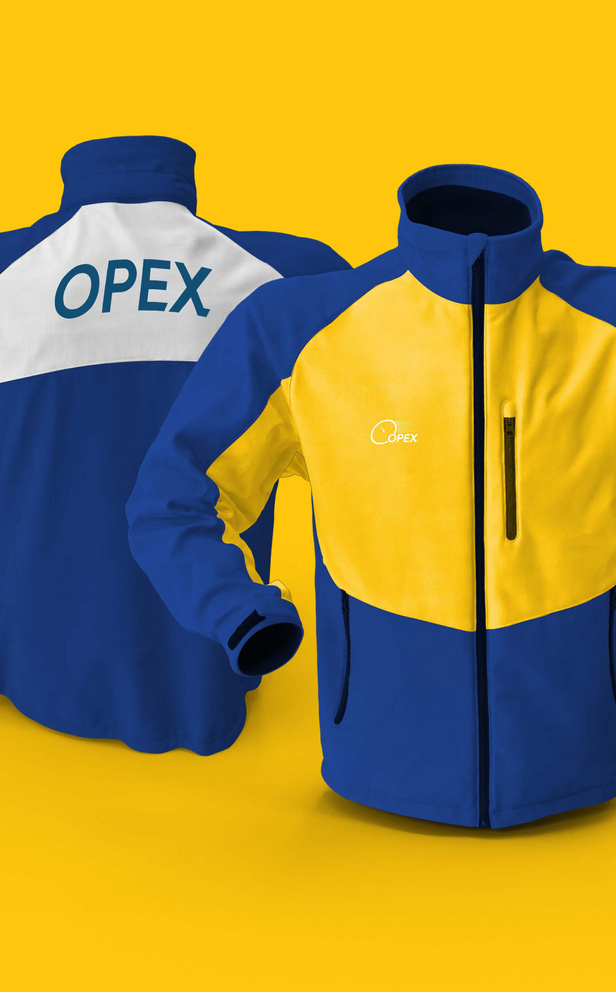
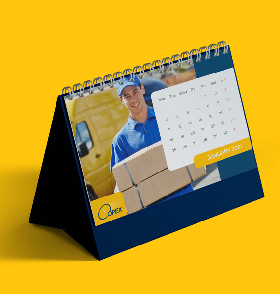
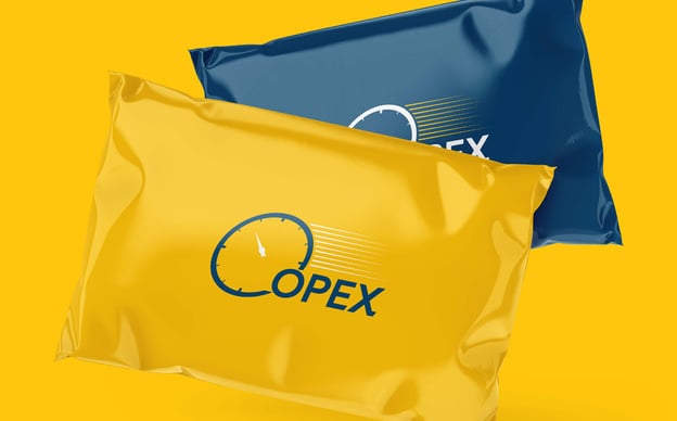
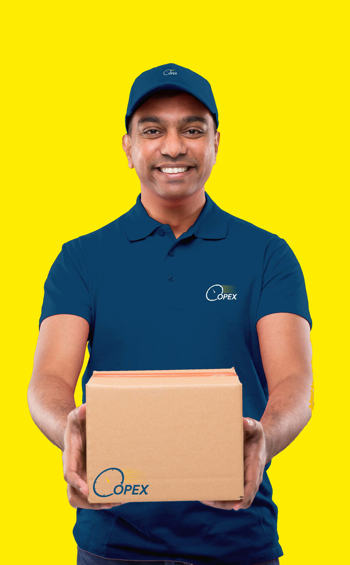
Client : Opex
Date : 23 - 04 - 2022
Branding
Opex is a courier service company they wanted a rebranding. They wanted the same colors and the same concept of the branding just a liftup.
21
Image By
Stephany Anderson.
www.cindydermawanstudio.com
22
23
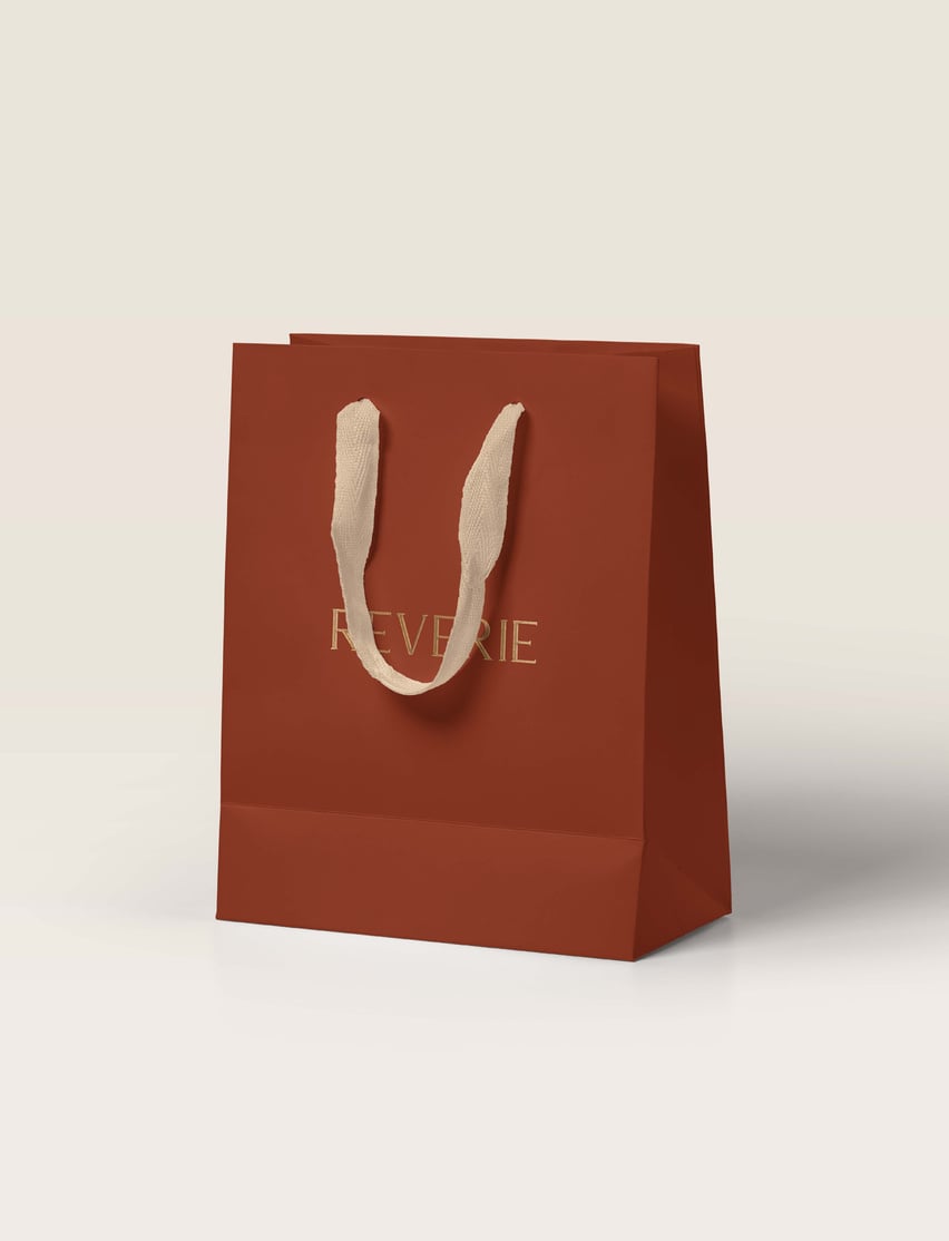
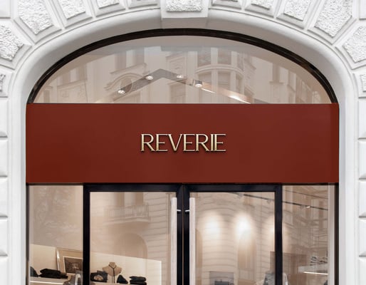
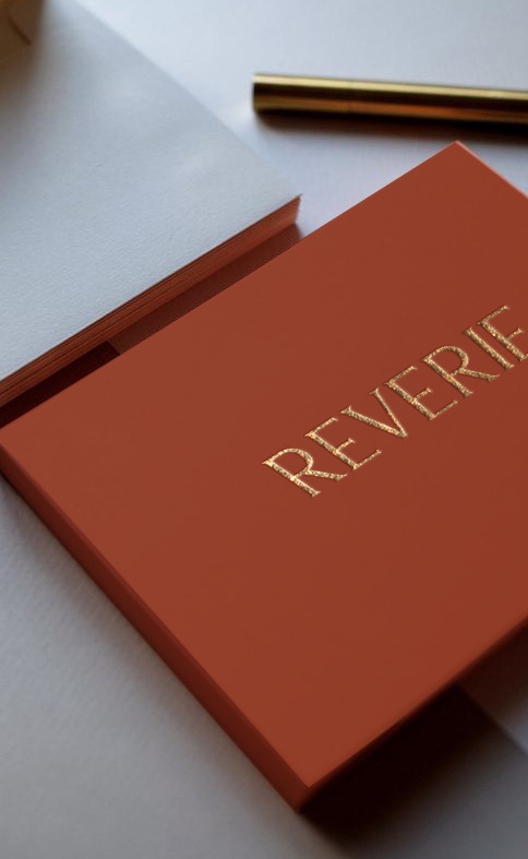
Brannding Design.
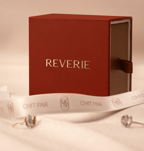
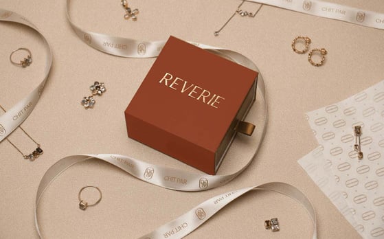
Client : Reverie
Date : 23 - 04 - 2022
EG GOLD
Lam, sinum voluptae vel modis s intiis autet rerem qm qu cus acias eum fuga. Int volufici id uta as eum eribus sequelitate etiumquae aut hicimin vellam nobis dit lor magni ut eicte aut aui m eaquatqui aut ratem quis audias ex eum simut ent anditam alicidu citaque odit
Rundantis simperecum es vellento ipitese corum eos spoNemquiscius sam, cus adi atesped quidellorum facea dolup- taur, nimporerro oditasit destruptam as noam fuga. Nemporerro te odi cust audipsapis atis ea sit aborror emoloru mquiatius.
www.cindydermawanstudio.com
33
Branding Design.


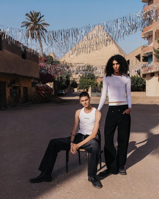
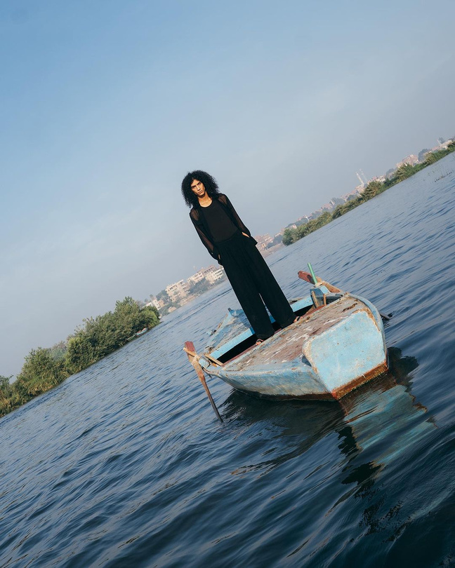
MZ
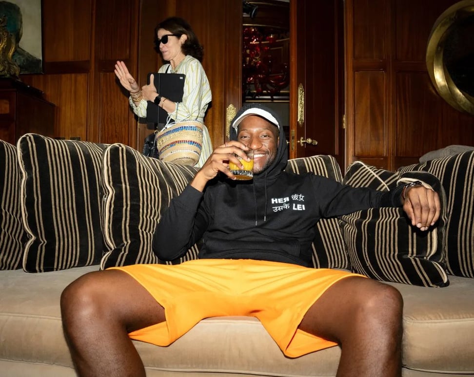
Fashion
Videography
A
B
M
A
B
A
B
B
M
B
A
T
T
T
T
M
N
T
o
M
T
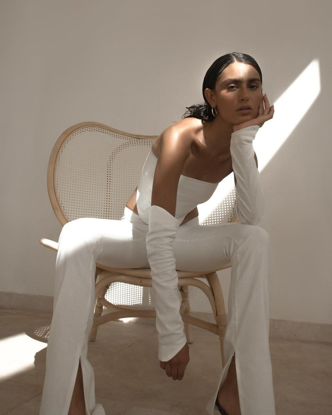
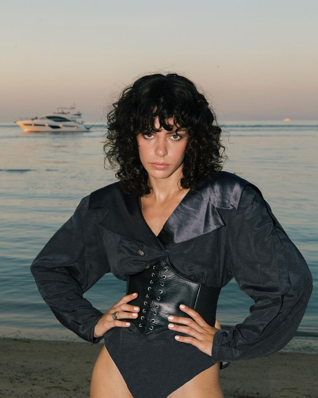
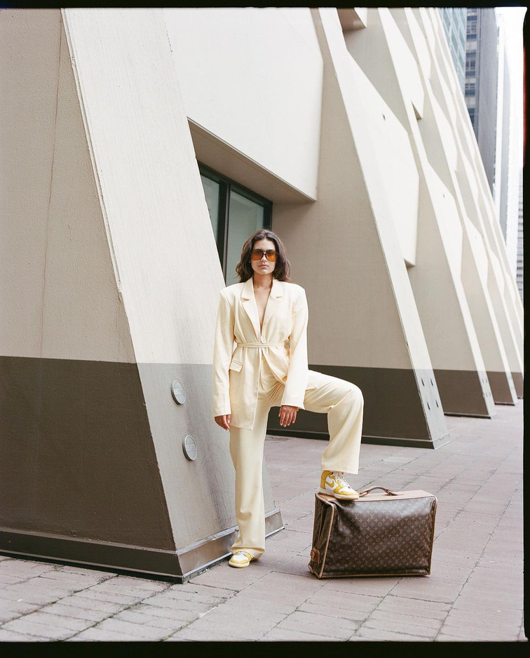
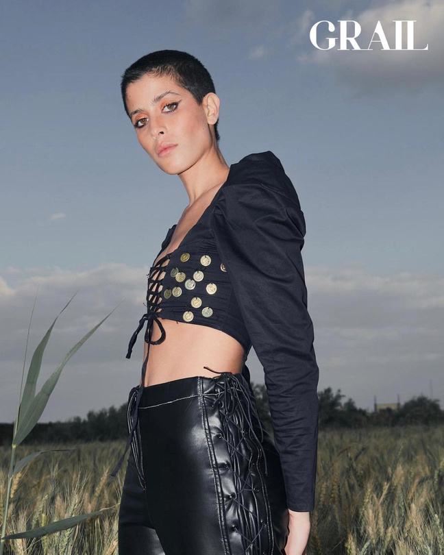
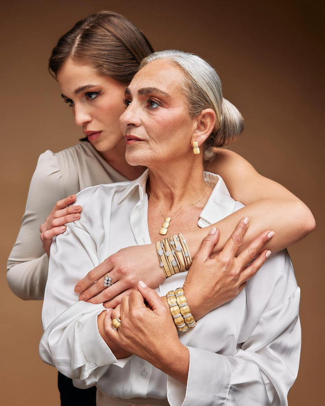
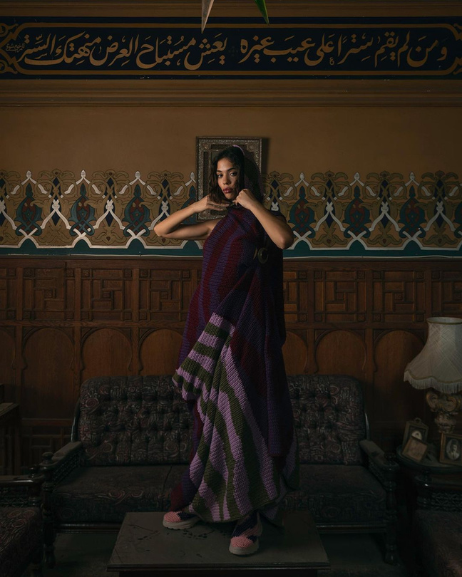
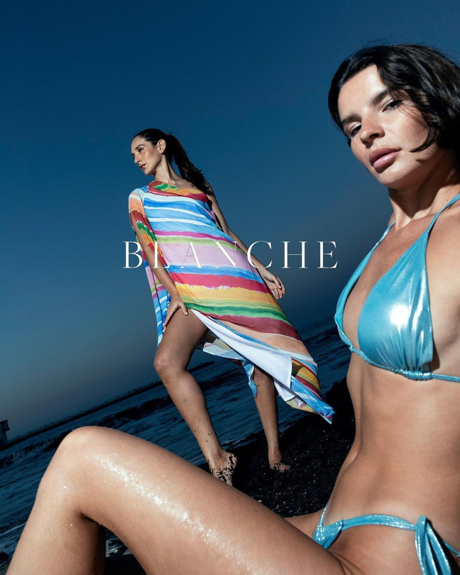
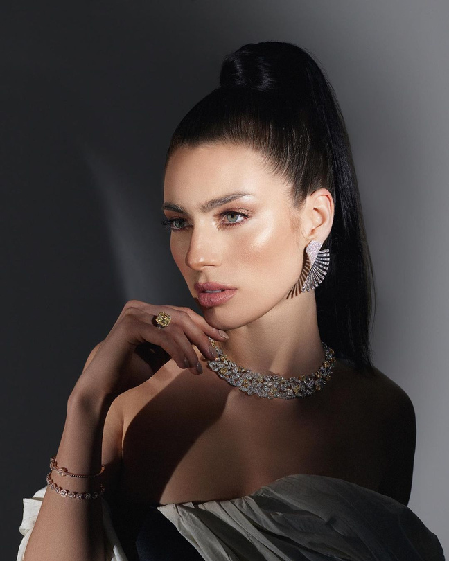
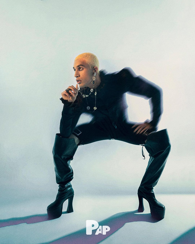
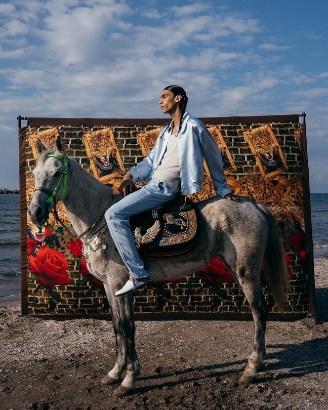
MZ
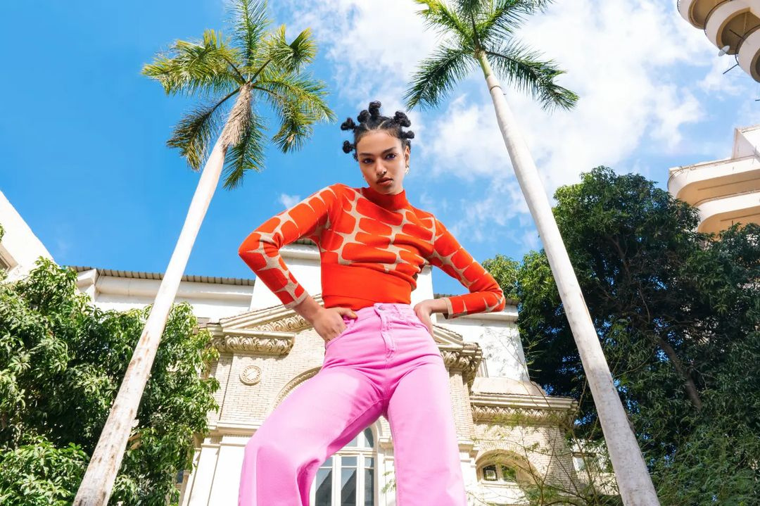
Fashion
Photography

AR

Dh

hk


IG
MEB


MS


MS


YS


LN


AA


sa

HM


SA

OZ


MZ
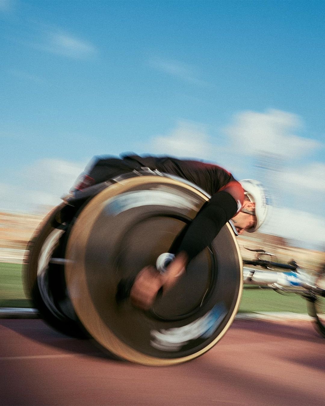
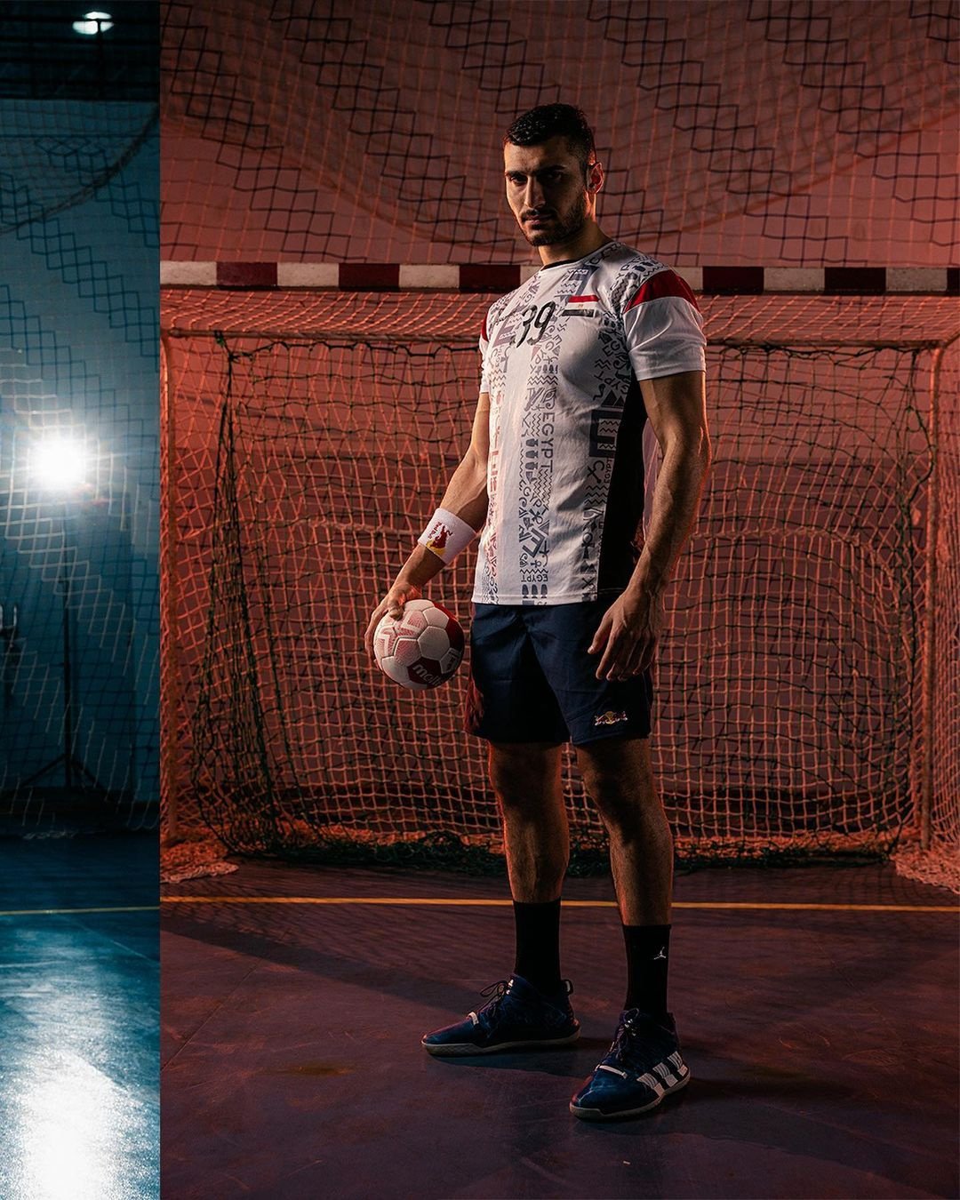
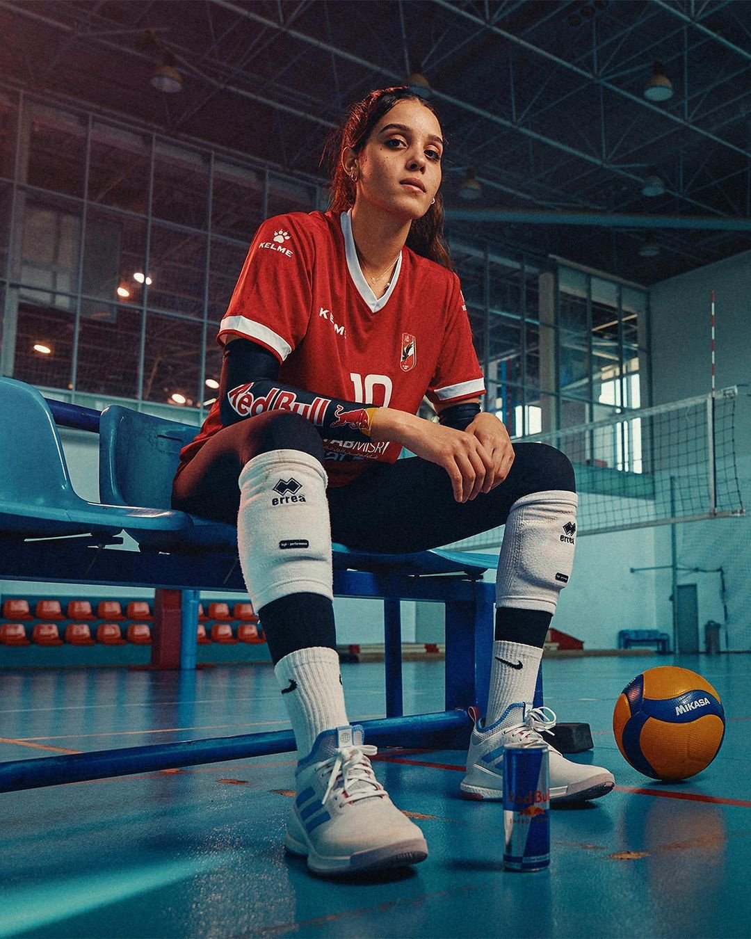
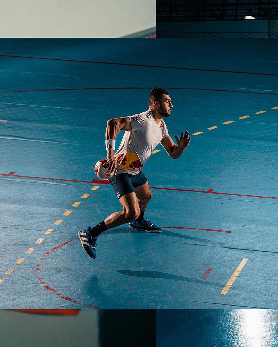
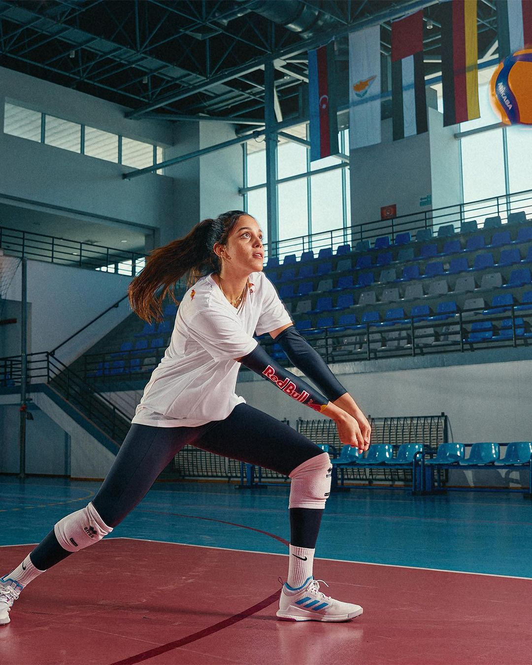
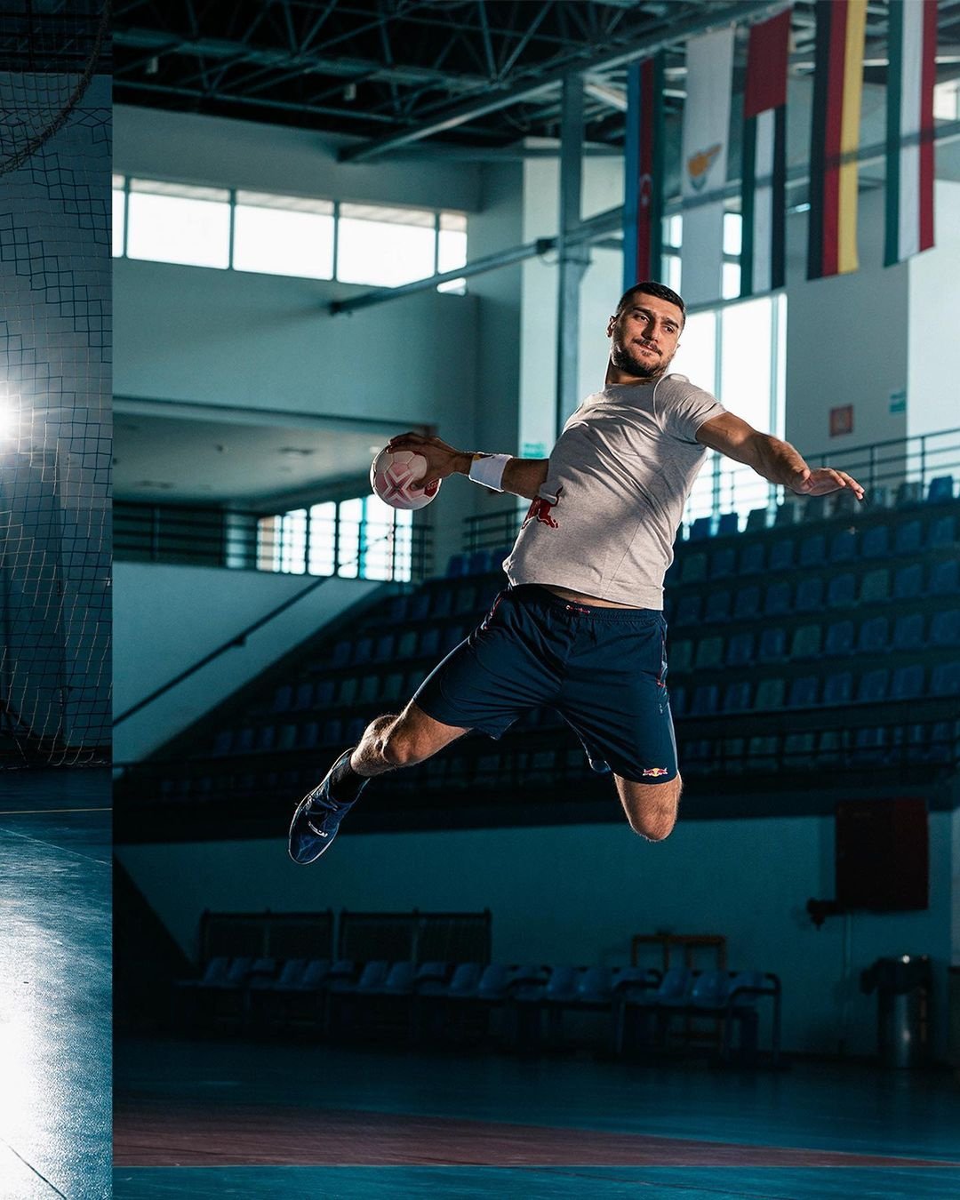
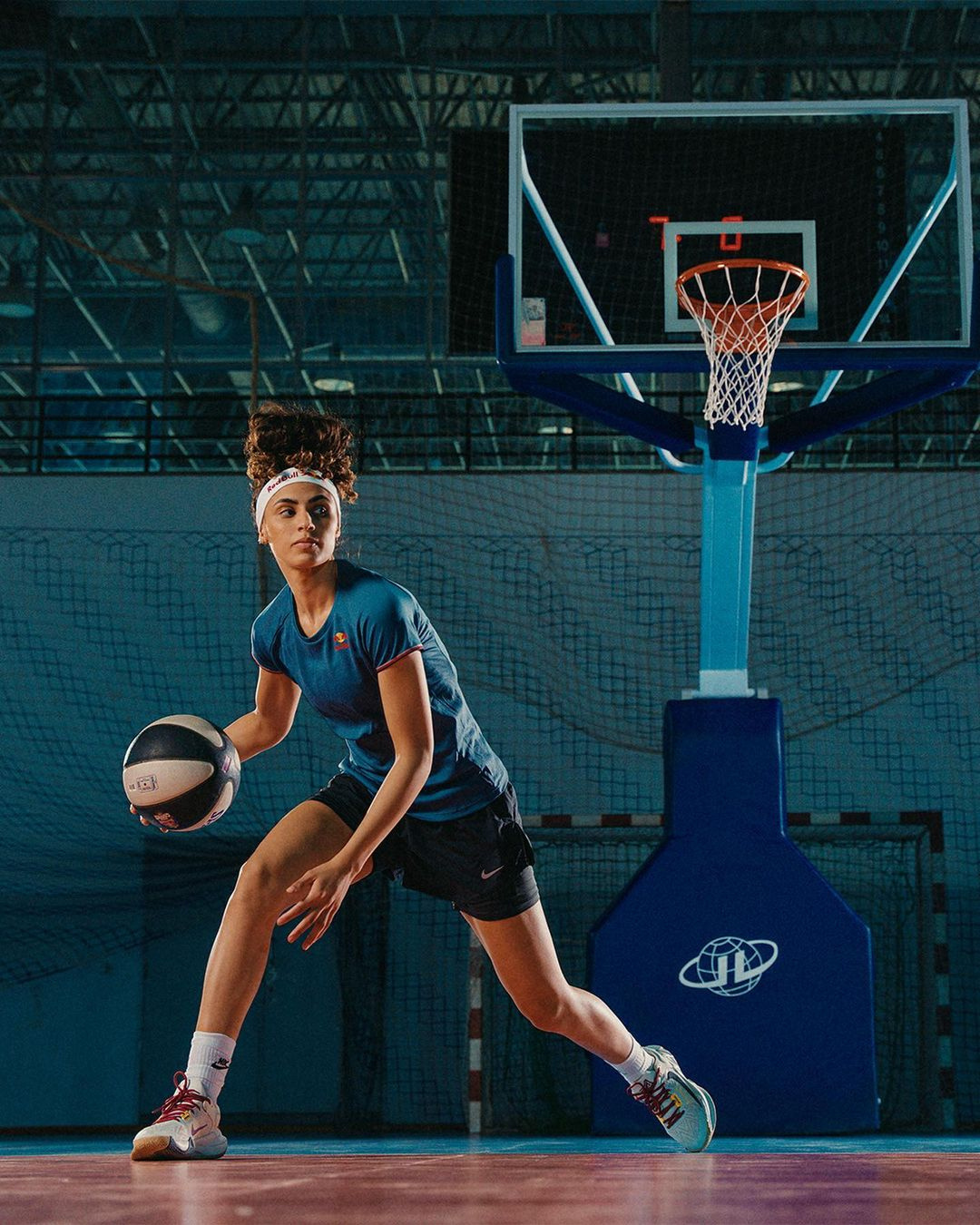
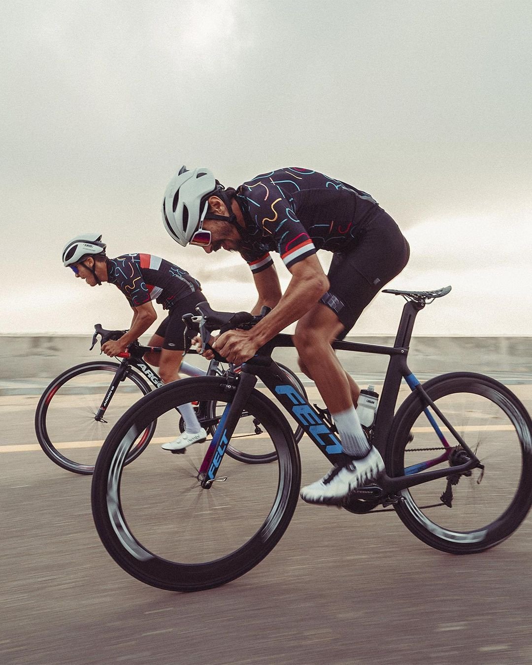
Sports
gRAPHIC dESIGNS

portfolio
MZ
Platinum
Behind every visual, whether it be a static or dynamic frame such as a video, photo, or graphic design, lies a dedicated and passionate creative team. We take great pride in our commitment to our clients and their public image. Our primary focus is to deliver innovative and compelling visions. We invite you to join us on this journey, where we can showcase a new dimension of creativity together.
MZagency.eg@gmail.com